Artist’s Books
When I was in Boston during the State of Emergency in South Africa, I became obsessed with the artists book as a democratic force. Books were banned because books were powerful as they were seen as a threat to the state. My work took on more and more of a documentary shout-out, and I called my Masters show State of Emergency (1988). From making small books, I developed larger friezes spanning a narrative, until they became standing screens - partly due to my frustration of communicating the realities in South Africa at the time, and to force the art community around me in Boston to try and address my work as something beyond merely the painterly or seductive surface of a print.
Artist’s Books:
Kim & Me & Books
Robbin Silverberg
Kim Berman and I met in 1995 and have been collaborating ever since! From papermaking sessions to teaching the trainers of Phumani, critiques and teaching at TWR / UJ, and collaborations at APS … working with Kim has always been a joy and challenge. But without a doubt, our artist book collaborations have been a highlight of my artist book practice.


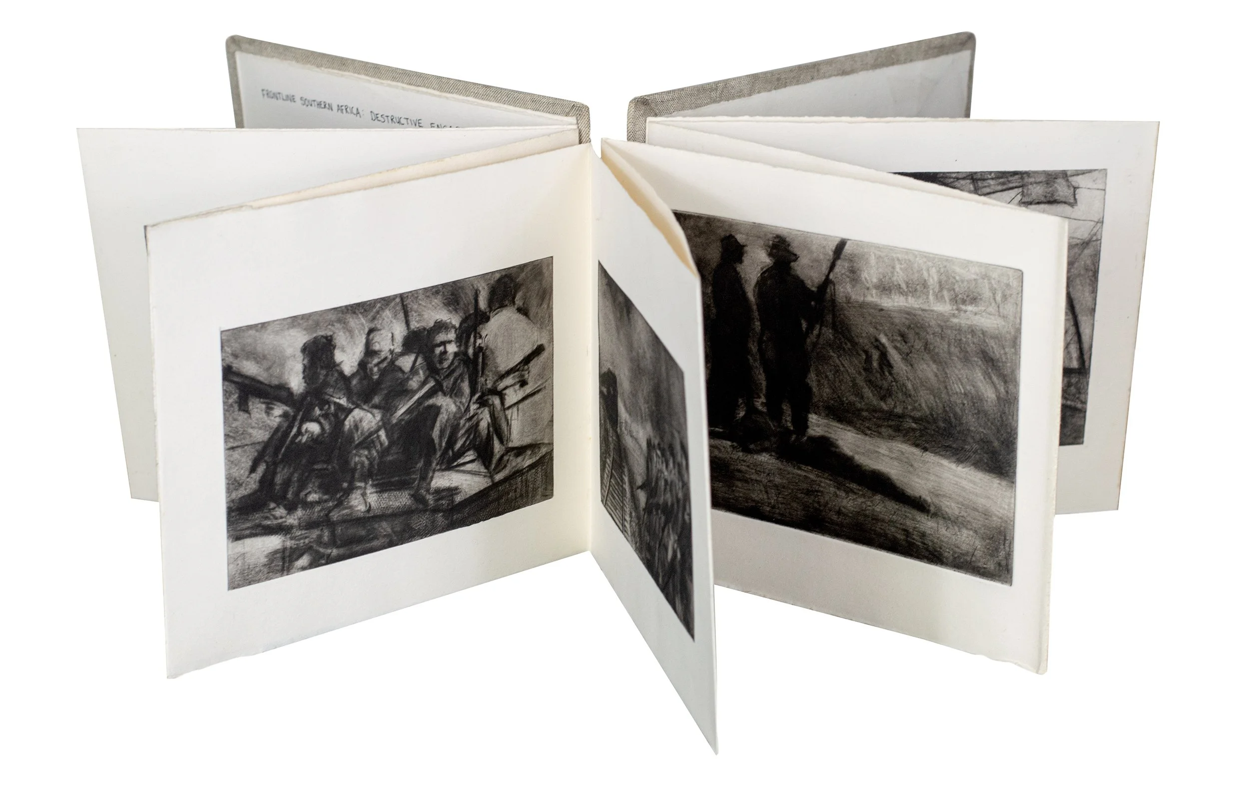
Tracks, 1999, Varied edition of 4; Drypoint & monoprint on Dobbin Mill papers, with embedded materials
Kim and I decided to work together after collaborating in a large cohort at APS on Emandulo Re-Creation (1997). She was in the States in 1999 and made some time for our first book.
Kim spoke of mines & train tracks … imagery that evoked some of the traumatic landscapes of apartheid. I was also dealing with manufactured structures … stairs, usually symbols of transcendence. However, the Todes Steige, the Staircase of Death at Mauthausen labor camp, Austria, represented a totally different concept. These were our catalysts and starting points for the project Tracks, and we worked with gusto.
I was pregnant and had an amniocentesis scheduled while she was in NY, so I was under strict orders not to lift anything heavy. As such, I sat in the (Dobbin) mill and guided Kim in making the paper for this book. Small sheets made that a possibility. The papers were hard and stiff and expressive… wonderful potentials to then print on. I also have a small etching press in my studio, and so the book was produced at Dobbin Books.
The final result was a series of horizontal board and paper pages tied together while spaced apart, looking very much like a ladder when hung vertically but like tracks when laid down on the ground.
Two years later, we again co-published Dihangara Uhanga (2001), in a large group collaboration. Sadly, it took sixteen more years before our next artist book.


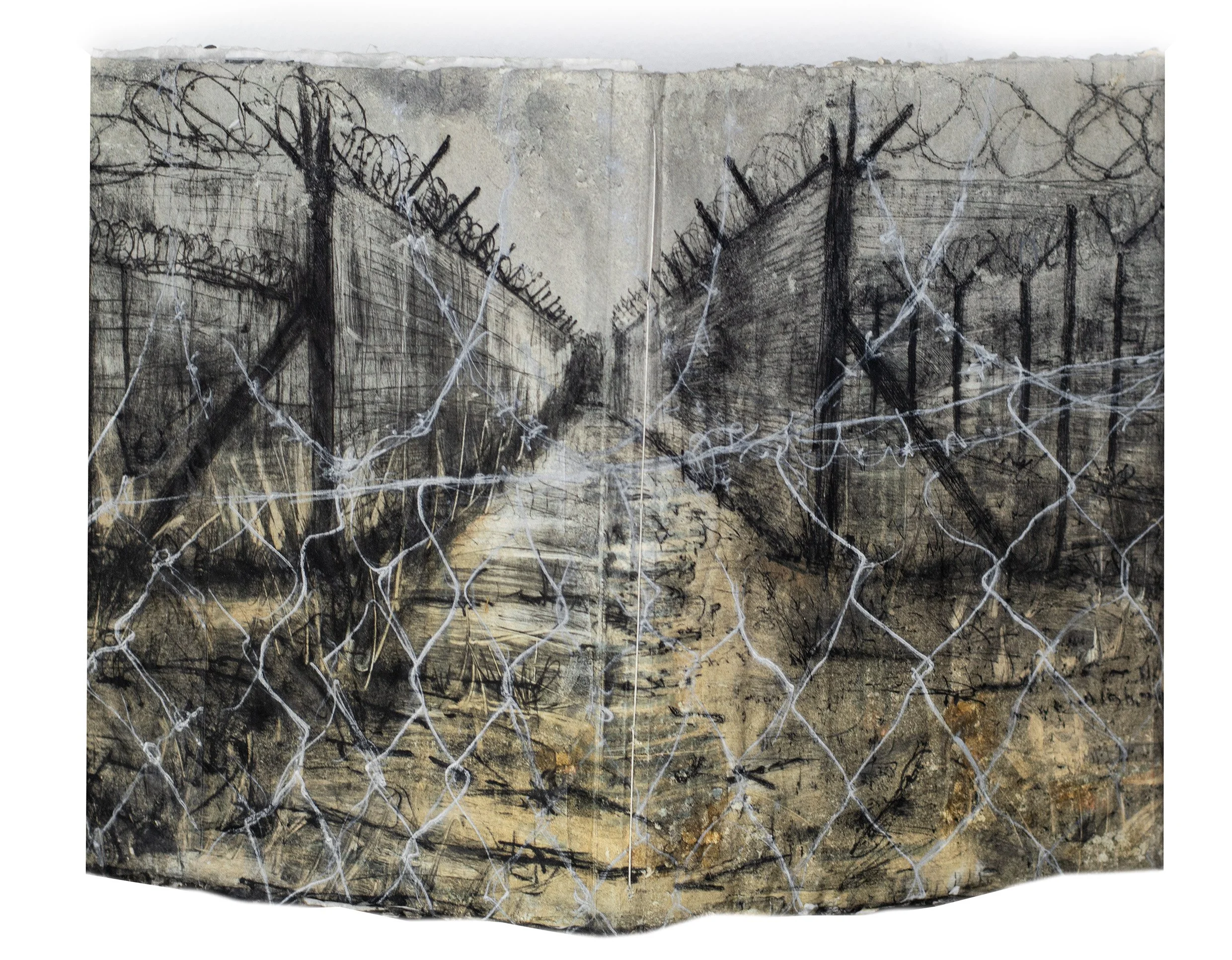
Kakistocracy, A Response to our Dual Political Realities, 2017, Varied edition of 7; Drypoint & monoprint on Dobbin Mill papers / Portfolio paper by Mary Hark ~(https://www.robbinamisilverberg.com/kakistocracy)
As artists from two nations both presenting as kleptocracies, we felt it imperative to make our statements in the artist’s book Kakistocracy. We chose to represent our countries as dumping grounds, with barbed wires and fences. I made the handmade paper in advance in my papermill: either with water-formed holes or larger sheets with embedded detritus. Kim came to NY, where we designed and proofed the book. I then went to Johannesburg, where I was Kim's print assistant, to edition the book.
The text was repeatedly printed from drypoint plates, like a drumbeat or heart throb, creating layers of ink abstractions, broken up by the many holes. It states simply:
"Kakistocracy is a term that has been used to describe a state or country run by the worst, least qualified, or most unscrupulous citizens. It combines qualities of "nepotism, oligarchy, plutocracy, kleptocracy, demagoguery, alt-right values, and a disturbing tendency toward fascist nationalism".
The double pamphlet French-door structure allows for many presentations and enhances the non-linear exploration of these ideas.


Walls of Kakostopia, 2019, Varied edition of 8; Drypoint, monoprint, collage & drawing on embedded & pulp-painted Dobbin Mill papers. Etched metal slipcase / Texts by the artists and from online dictionaries (https://www.robbinamisilverberg.com/walls-of-kakistopia)
Walls of Kakostopia was, in many ways, a continuation of our previous collaboration. The dominant technique was expressive painterly monoprinting (Kim’s forte) with drypoint text mixed in. The structure remained the same, although we folded the book in half and placed it in a folder. It continued to explore the shortcomings of our respective governments (the United States and South Africa), reinterpreting present-day visual landscapes of fences, walls, and barriers of all sorts (from Robben Island, Palestine, and the US).
Since the book's thematic focus was the wall, it contains definitions of that word (my love of language). It also included lists of government expenditures, embedded texts about corruption, and Trump quotations.
For this collaboration, I prepared the paper and carried it to South Africa, where we worked diligently at every opportunity in her print studio. However, our time together was still too short; I brought all the materials back to Dobbin Books and continued reworking the books, completing it by etching the metal cases.
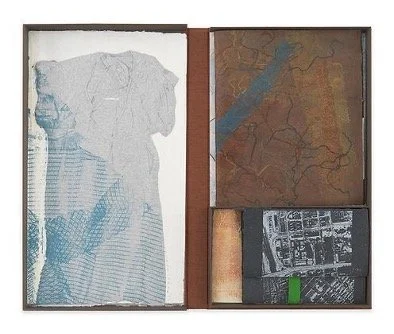


RE— Tale of Two Cities, 2022/23, Varied edition of 10; Drypoint, etching, monoprint, digital, silkscreen, and collage on Dobbin Mill papers with embedded detritus, clothing, plastic mesh and packaging materials (https://www.robbinamisilverberg.com/re)
RE_ A Tale of Two Cities is our most recent collaborative artist book edition. Kim proposed the topic of recycling, with Bekezela, a Joburg community of reclaimers, as the main inspiration. Besides the focus, we had no time to develop our ideas in advance. Having no prior knowledge of Joburg’s recycling issues, I hesitated … also as a person coming from affluent America, I was unsure how to engage with these issues. I produced the paper without any idea of where this project would take us, which differed from how we had previously collaborated. Interestingly, the papers, with their embedded detritus, created the parameters for the project.
The imagery is based on our photographs taken of the streets of Brooklyn and of Bekezela. The text creates the sequencing, by comparing the terminology used in South Africa ('reclaiming') and the US ('recycling'). RE recognizes the value of reclaiming/recycling and renders the invisible visible.
I wanted us to experiment with other techniques. We included silkscreen and inkjet printing and materials connected to recycling. The cover is made of a synthetic cloth used in Joburg, with unique relief prints. Two pamphlet compendia were included, consisting of pages made of packaging materials from the two countries. Half the edition is boxed with an actual shirt embedded in the inside cover; the other copies are contained in printed bags made of recycled materials.
Kim and I have spoken about doing another book collaboration. I hope we do.
Additional thoughts:
— We are both middle children… in lineups of 4 and 5 daughters. This position has given each of us resilience and flexibility.
— We love to learn from one another and, in that learning, push our boundaries.
— Kim comes to a collaboration with masterful printmaking skills (and the commensurate muscle) along with an astute talent for collaboration. Her passion and commitment to making the world a better place is a true inspiration.
— I love the complexity of books as structures, and I bring 40 years of papermaking and bookmaking experience to the projects.
— Although I am writing this short essay for Kim, I must admit that she has already said it best: "When we co-create, we can match each other's energy and intensity. Magic happens in the process."